Chrome hearts
Spring Crosses
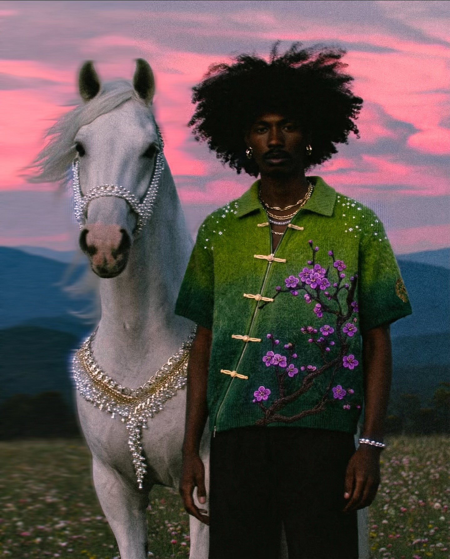
This concept reimagines Chrome Hearts by stripping away its signature dark, gothic aesthetic and rebuilding it through a soft, floral spring lens. The goal isn’t to replace the brand’s identity, but to reinterpret its core symbols crosses, motifs, and ornamentation into something lighter, more delicate, and emotionally open.
Client
Chrome Hearts
Year
2026
Industry
Fashion
Turnaround time
2 weeks

Challenge
The challenge was twofold:
Reframe Chrome Hearts without losing its identity
Shift the brand away from its heavy, gothic aesthetic into a softer, floral-driven direction while still retaining its core symbolism, craftsmanship, and cultural edge.Balance softness with credibility
Introduce a romantic, spring-inspired visual language without diluting the brand’s authority or making it feel overly commercial or disconnected from its roots.
We needed to build a cohesive visual system and tone that could live across:
AI campaign imagery
Editorial storytelling
Product presentation
The campaign reimagines Chrome Hearts as a soft, romantic artifact, transforming its traditionally dark, gothic identity into a floral, spring-driven visual language. Built on contrast—hard vs. delicate, rebellion vs. calm, metal vs. bloom—the shirt becomes a bridge between the brand’s legacy and a lighter, more expressive future.
Product Strategy
The shirt is positioned as a crafted statement piece, not just apparel.
Key details are intentionally reframed:
Frog closures + structured knit → heritage craftsmanship
Floral embroidery (cherry blossoms) → softness, growth, seasonality
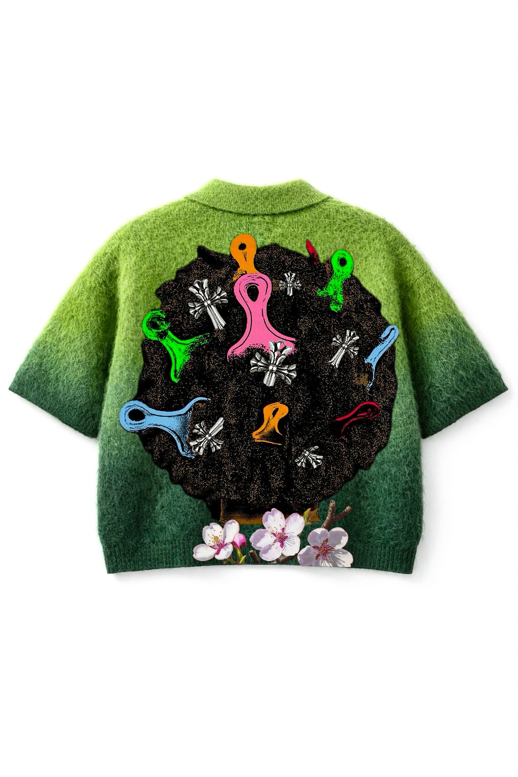
Chrome Hearts cross motifs (back) → preserved identity, but recontextualized
Gradient green palette → nature-driven luxury
Approach: Maintain the brand’s DNA, but soften its delivery through material, color, and symbolism.
Visual World
The campaign shifts from darkness into a dreamlike spring environment:
Bloom-heavy landscapes → emotional warmth
Open nature settings → freedom, rebirth
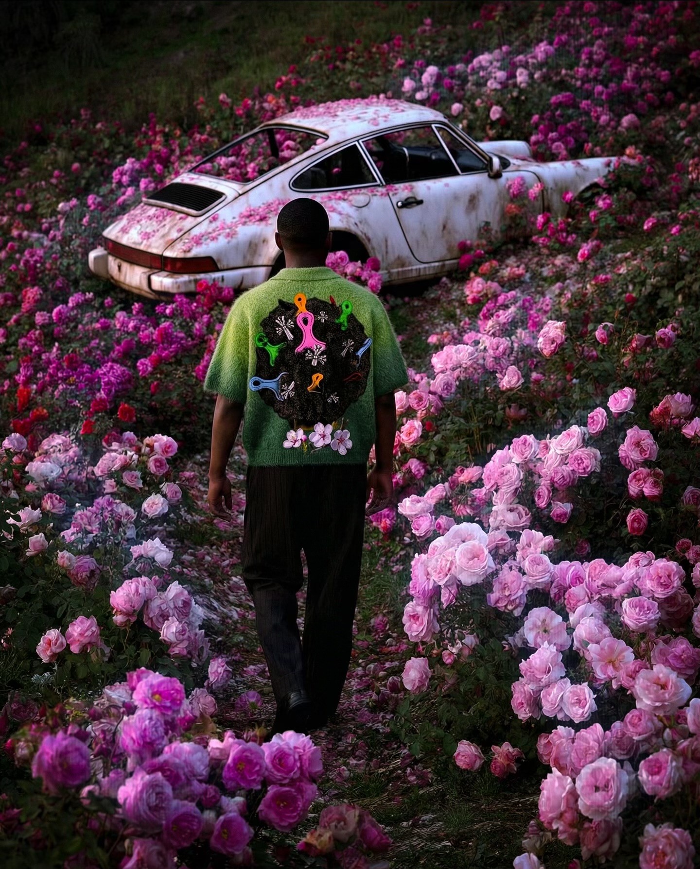
Surreal inserts (horse, abandoned car in flowers) → contrast + narrative depth
This creates a world that feels:
romantic, slightly surreal, and elevated beyond streetwear
Symbolism Layer
Flowers (cherry blossoms / roses): rebirth, softness, transformation
Horse: purity, grace, quiet power (replacing aggression with elegance)
Overgrown car: decay meeting beauty → aligns with Chrome Hearts’ rebellious roots, but softened
Casting & Styling
Clean, minimal styling to avoid competing with the garment
Jewelry remains—but feels lighter, more refined
Natural hair + floral integration → merges human + environment
Silhouette remains balanced:
Structured top = identity
Relaxed bottoms = ease
Shot Direction
Hero portraits: centered, calm → emotional presence
Environmental shots: subject within florals → immersion
Back shots: highlight graphic + identity shift
Close-ups: texture, embroidery, softness
Movement is slower, more poetic—less aggression, more atmosphere.
Lighting & Color
Soft natural light / golden hour tones
Slight bloom/glow → dreamlike finish
Palette:
Greens → grounding
Pinks → softness
Deep shadows (controlled) → subtle nod to original DNA
Overall grade leans toward:
painterly realism over harsh contrast
AI Role
AI is used to construct a controlled surreal softness:
Perfect floral density and environments
Seamless integration of symbolic elements (horse, car, blossoms)
Consistent tone across scenes
The output remains photographically believable, not overly synthetic.
Outcome
Chrome Hearts is reframed as emotionally versatile, not just dark and aggressive
The brand gains a new visual territory: romantic luxury
Why It Works
Strong reinterpretation without losing identity
Clear contrast from existing brand language
Visually distinctive (scroll-stopping softness vs expected darkness)
Elevated, editorial execution
Final Read
The shirt is no longer seen as gothic streetwear—
it becomes:
a soft-coded Chrome Hearts piece—where rebellion evolves into beauty, and edge transforms into quiet luxury.